Data Visualization
During my PhD, I relied heavily on data visualization to turn complex results into clear, accessible insights. I often analyzed parton distribution functions (PDFs) to predict measurable outcomes, and I had to create clear, informative charts both for technical reports and for communicating with non-specialist stakeholders.
Below are selected examples showcasing how I visualized data from my studies. Most of these figures were produced using Mathematica with the ManeParse package or CERN’s ROOT framework, widely used in particle physics. You can find more information about ManeParse here and ROOT here.

L2 sensitivity plots as a function of momentum fraction x, illustrating the impact of the specified dataset on each proton PDF. The y-axis shows the change in chi-squared when the central value of the PDF is varied by one standard deviation.
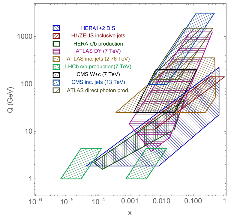
Data coverage of the experiments analyzed in the L2 sensitivity study, shown as a function of momentum fraction x and energy scale Q.
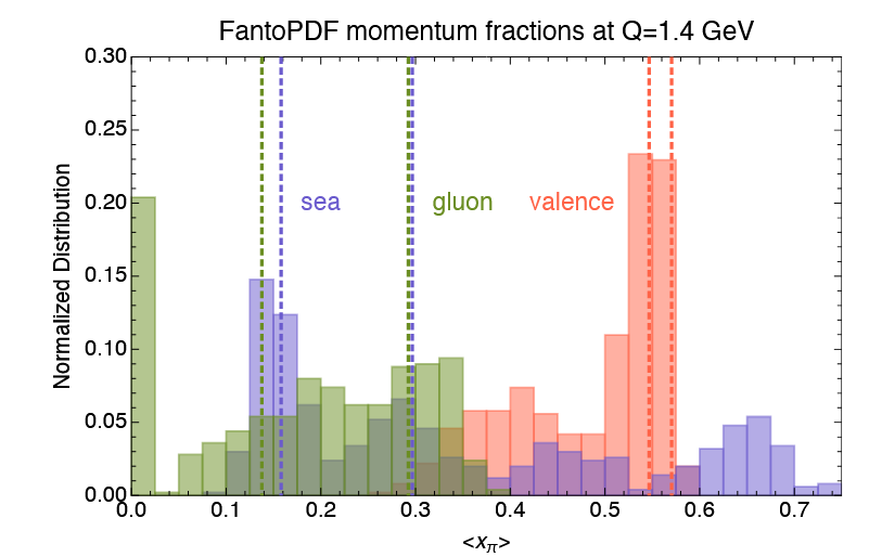
Histogram of momentum fractions for each parton within the pion, compiled from all viable solutions identified in the study. The distribution is normalized to reflect percentages.
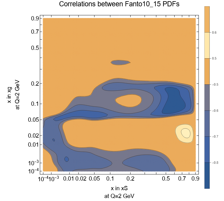
Heat map showing the correlation between two PDFs in the pion study. A strong anticorrelation is observed at low momentum fraction x (blue regions).

Correlation heat map of a single pion PDF with itself. The plot shows that an increase in the PDF at moderate x (x∼0.1) is correlated with a decrease at small x (x<0.01). This behavior reflects the limited data available at small x, and is consistent with expectations for future fits incorporating additional data in that region.

The momentum fractions of the gluon (⟨xg⟩) and quark sea (⟨xS⟩) pion PDFs. Five selected good-fit models are shown with uncertainties (solid crosses). The combined model (green) represents the distribution of momentum fractions at the 68% confidence level. The strong linear anticorrelation between ⟨xg⟩ and ⟨xS⟩ reflects a significant degeneracy in the model.
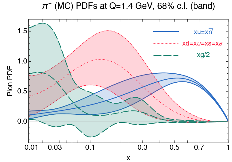
The three independent pion PDFs shown with their central values and uncertainties at the 68% confidence level, plotted as a function of momentum fraction x.
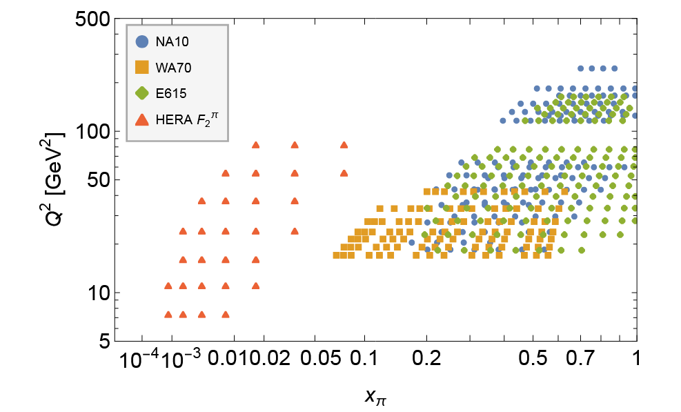
Data points from the experimental pion datasets included in the study, shown as a function of the pion's momentum fraction and the squared energy scale Q2.